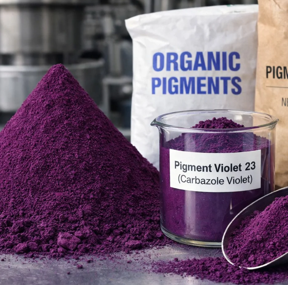
A warm-tone carbazole dioxazine violet with a red-leaning masstone, delivering exceptional brilliance, high transparency, and superior weather resistance. The preferred grade for premium decorative coatings, high-end artistic colours, and deep purple-red shades in inks and paints where a warm, rich violet — rather than a cool blue-violet — is required.
Both PV23 grades share the same carbazole dioxazine chemistry and CI number (51319), but differ in the particle size distribution, surface treatment, and crystal habit, which shift the masstone hue toward red or blue. The Redder Tone produces a warm purple-red masstone — ideal for achieving deep burgundy-violet shades in paints and inks. The Bluer Tone reads as a cooler blue-violet — the grade used for white paint optical brightening and neutral violet tints. Choose the Redder Tone when your target shade is a deep, warm purple; choose the Bluer Tone when you need a cooler, blue-leaning violet or toning agent.
| Property | Standard / Note | Rating |
|---|---|---|
| Lightfastness | ISO 105-B02 — ISO 8 | |
| Heat stability | Up to 200 °C | |
| Transparency | — | |
| Weather fastness | Exterior exposure | |
| Colour strength / brilliance | Full masstone | |
| Acid resistance | — | |
| Alkali resistance | — | |
| Migration resistance | Plastics / PVC |
Both grades share the same chemistry — the key choice is which masstone direction fits your target shade.
Cool blue-violet masstone. The grade used for white paint optical brightening (0.005–0.05%), neutral violet tints, and process violet in printing inks.
Warm red-violet masstone. Chosen for deep purple-red coatings, high-end decorative paints, and artistic colours where a rich, warm violet hue is the target.
The primary application for the Redder Tone. Delivers brilliant, deep purple-red and burgundy-violet shades in high-end decorative emulsions and architectural coatings for premium interior applications. Outstanding wash resistance and transparency.
Excellent weather fastness (ISO 8) and acid/alkali resistance make this grade suitable for industrial maintenance coatings and architectural exterior finishes where warm violet-purple shades are required with long-term durability.
Used in oil paints, watercolours, acrylics, and gouache where the warm reddish dioxazine violet is valued by artists for its transparency and colour strength. A staple pigment in professional-grade artist colour ranges worldwide.
High-strength reddish-violet for spot colour printing inks where deep purple-red shades are specified. Excellent solvent compatibility in gravure and flexographic ink systems. Used for premium packaging with violet/purple brand colours.
Used in binder-based pigment printing for cotton and synthetic fabrics where warm violet-purple shades are required. Excellent lightfastness makes it suitable for fashion and home textiles with prolonged UV exposure requirements.
Suitable for purple masterbatches in polyolefins and PVC at processing temperatures up to 200 °C. Exceptional tinting strength means very low loadings achieve strong, clean violet-purple plastic goods. Verify heat stability for engineering polymers.
Presscake form is preferred for solvent-flush pastes and high-quality ink grinding, giving superior transparency and tinctorial strength versus dry powder. Aqueous dispersion grades available on request for waterborne paint and ink systems.
Registered under EU REACH regulation. Full SDS available on request for compliance documentation.
Contains no lead, cadmium, mercury, or chromium VI. Meets international packaging and environmental directives.